Data Art

40x by Maya Pruitt

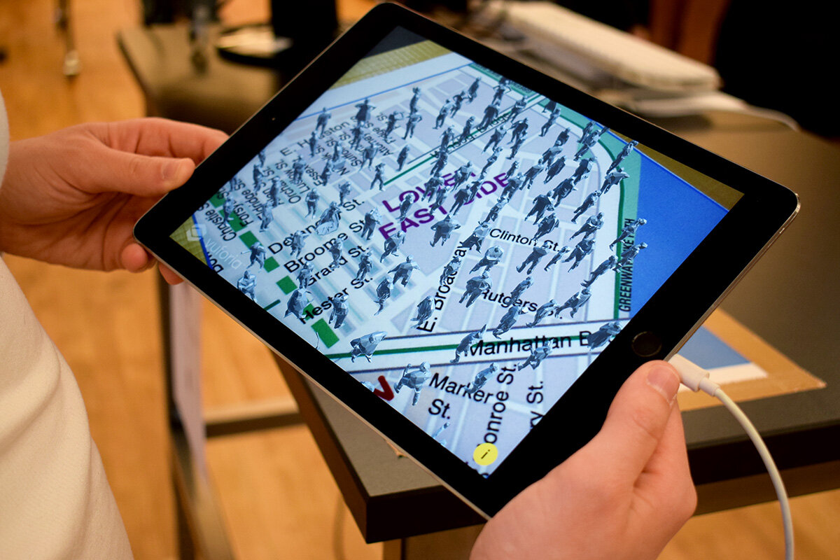
What? 40x (pronounced “Forty Times”) is an augmented reality data art piece that illustrates the lack of affordable housing in the Lower East Side. In NYC, property management companies require renters to have an annual income of 40 times their monthly rent. In certain areas the disparity of rent prices to median household income is incredibly stark, very much so in LES. In this experience, users see 100 figures appear representing the total population of the Lower East Side. Over time the figures disappear leaving a remaining 8% of people to represent those who can actually afford to live in their neighborhood based on the 40x rule. Users can toggle for more information and statistics regarding the data used in this project by touching the screen.

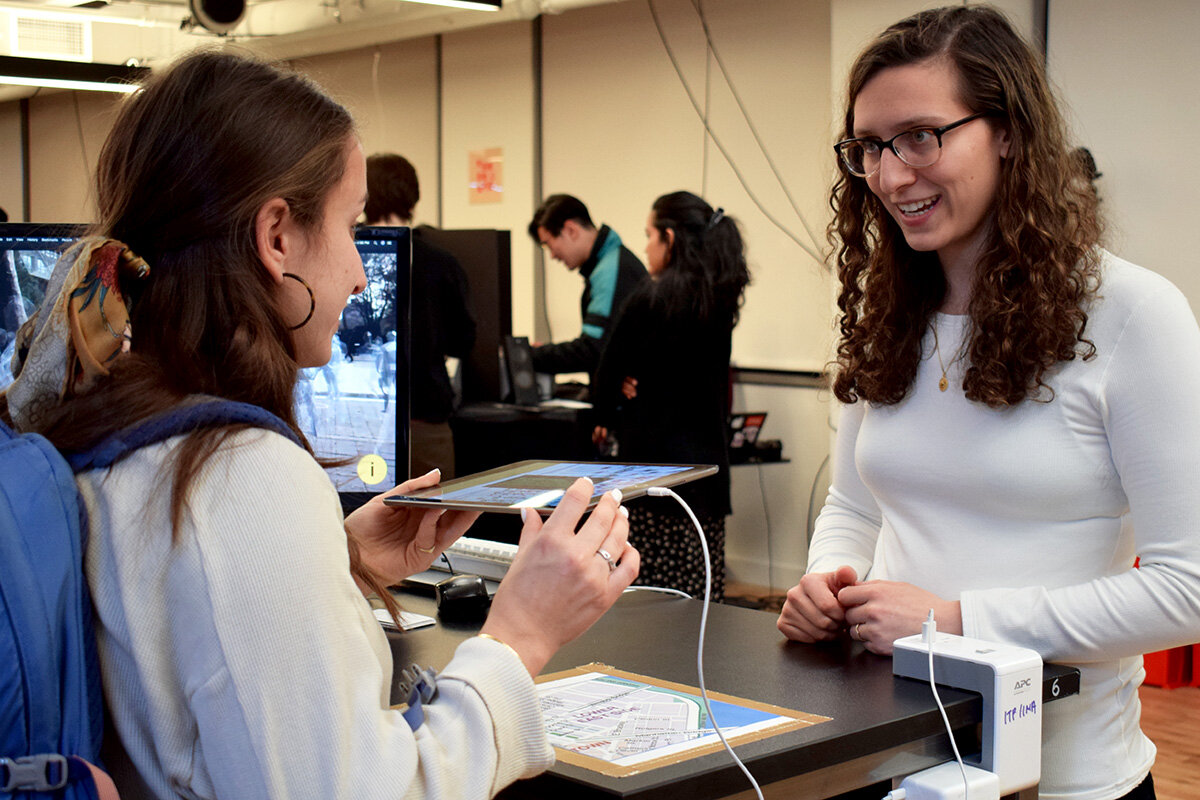
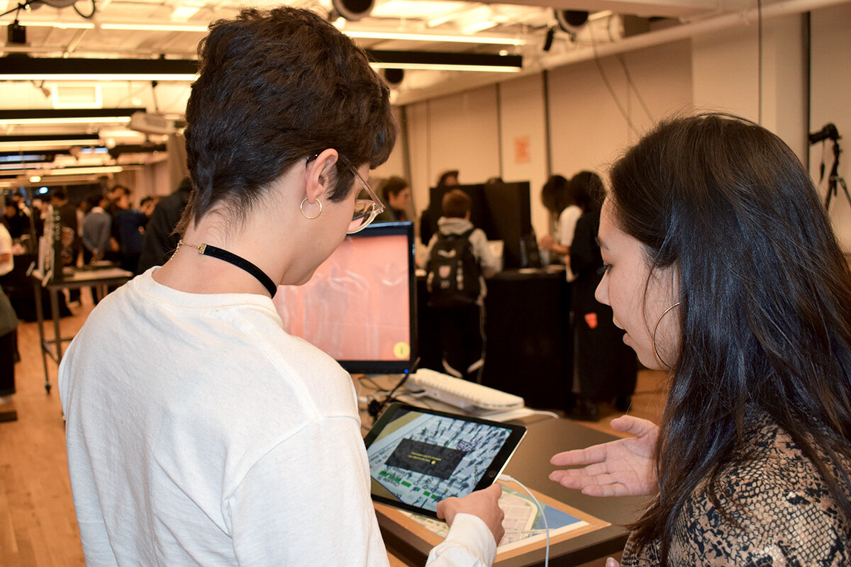
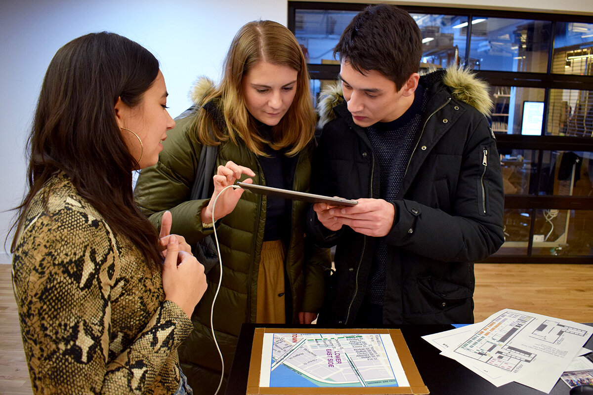
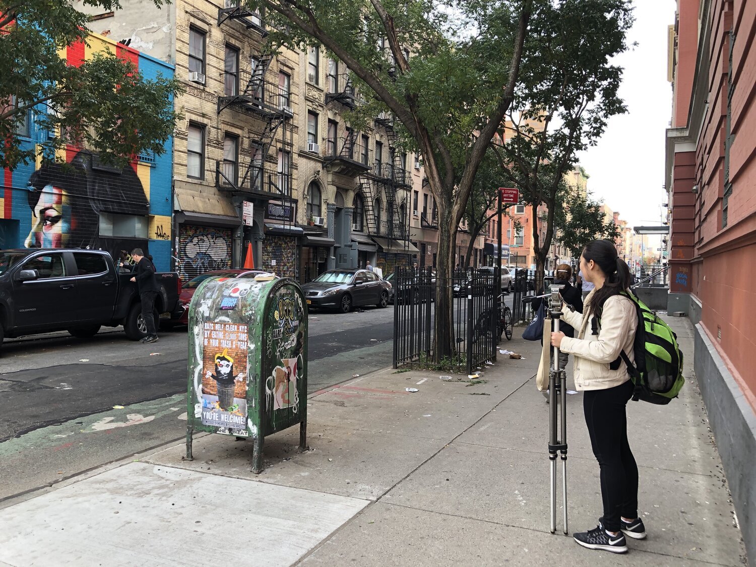
How? This AR experience was designed in Unity and presented in two forms. The first, showcased in the video, acts as an intervention into public space. The mobile device searches for a ground plane so that figures may appear life size on location in the Lower East Side. The second form was a table top demonstration designed for ITP’s public exhibition, the Winter Show 2019. In this version, an image of a LES map spawns the figures.

Why? As New York evolves it is becoming progressively more unaffordable, affecting low income populations the most. With such a large of percentage of rent-burdened New Yorkers, meaning that households spend 30% or more of their incomes on rent, 40x serves to bring light to this issue and start a conversation.

The experience incorporates technical applications of Vuforia, ground plane tracking, image tracking, animation, and UI in Unity.

Created in collaboration with Caroline Neel.

See more about the research and design process:

40x at the ITP Winter Show:

Data Art - Maps & Publics: 40x Creation Process by Maya Pruitt

RESEARCH

As New Yorkers ourselves, Cara and I are no strangers to the cost of living in NYC. We began looking at articles covering rent costs and income levels of different populations throughout the city. We were especially inspired by a Curbed article entitled, New York’s most and least affordable neighborhoods and its supplemental map visualization. We were especially struck by how wealthy neighborhood and low income neighborhoods can exist right next to each other with such a disparity in income.

Areas like Long Island City, Queens, Williamsburg, Brooklyn, and the Lower East Side ranked among the highest for unaffordability. We decided to delve deeper into the Lower East Side as we are both Manhattanites living nearby LES and felt a more initial personal connection.

Screen Shot 2020-01-13 at 12.51.11 PM.png

From maps like these it was fascinating to see that neighborhoods considered “affordable” are actually those that are more affluent. The rents are still high, but because median income is higher, those living in these neighborhoods can more easily cover their rent payments. This lead us to researching more about the 40 times rule, requires renters to have annual incomes of 40x the monthly rent in order to lease apartments in NYC. If an individual cannot meet this requirement they are expected to have a guarantor who makes 80 times your monthly rent.

We compiled population, income, and rent cost data from multiple sources and averaged them to create the data set we would use for this project.

Table of our calculations.

Table of our calculations.

Annal household income data from censusreporter.org

Annal household income data from censusreporter.org

Chinatown & LES statistics from datausa.

Chinatown & LES statistics from datausa.

Our conclusions:

Median household income: $42,985

Average rent (2 bedroom apt.): $3952

40x rule projected income: $158,080

The LES population with an income bracket of $158,080 only represents 8% of the total population.

Household income brackets by population from statistical atlas.

Household income brackets by population from statistical atlas.

PROCESS

Cara and I were interested in creating a piece to intervene in public space. However, it was important to us that our intervention was legal, unobtrusive to the citizens of LES, and in a form not easily destroyed. We felt that augmented reality gave us the affordances of these considerations.

40x is built in Unity. In our design we wanted to use low poly 3D models to create the sensation of a crowd but also have them visually distinctive from people passing by. Our decision to have the people fade out slowly overtime was meant to create visual impact of the statistics we had researched. We also wanted to include written explanation of our research presented in a familiar form and in a way that could be toggled through at the user’s own pace.

Cara developed a wireframe of the design. I worked in Unity to build the AR and UI elements. Below is a test of the crowd animation using an image target.

Documentation of 40x was shot in the Lower East Side.

Jtait+FeQVOQH2qZVlfnLg.jpg
image-asset.jpeg


Data Art: Archive Conceptual Project by Maya Pruitt

Can data predict the next top pop song?

By exploring language processing and text analysis of lyric data, I hypothesize that there could be enough information to craft new music.

RESEARCH:

Billboard is an American entertainment media brand founded in 1894 originally as an advertising company. The brand began focusing on music in the 1920s and has famously been tracking the top 100 hit songs every year since 1940. This is decided by a combination of sales, radio play, and streaming popularity.

Pop music, or popular music, is exactly as it sounds. It is music that is popular for its time — songs that become ubiquitous in a way, because of their chart appearing status. Pop music has ebbed and flowed over time and can have influence from many different musical genres and styles.

But although, music is an art form, are there ways in which pop music becomes formulaic?

PARSING PROCESS:

How could we begin to make sense of what makes a hit pop song?

I began by looking at an existing dataset I found here. Using a scraping program this data set included the Billboard Top 100 songs form 1965 to 2015. This felt quite overwhelming, so I decided to focus on the most recent year first and create parsing programs that would look at 100 songs instead of 5,000.

To start, my goal was to find most common words, most common phrases, and lyrics that rhyme within the dataset. I used a combination of python and javascript to create parsers with different functions. My python code returns most common words and n-grams (sequences of words). The javascript code uses RiTa.js to find keywords in context as well as rhyming words in their context.

I noticed that the original dataset had quite a few flaws and it greatly effected the outcomes I was getting. I decided to go back and change my dataset (i.e words strung together without spaces, contained non lyrical information) , I selected the lyrics from the number one hit song for each year in the 2010s. With a new dataset I could ensure there were no issues like words being strung together or extraneous information like the song credits appearing as part of the lyric data. However, this is now a very small data set.

The results of the n-gram parser helped me identify words that occurred most among the lyrics. Since songs are often very repetitive I didn’t want this to skew the results. I made sure a word was only added to the count if it appeared again from a different song. I kept common words because they are often important to song lyrics and would increase the chance of finding grammatically correct phrases.

These are the results of the n-gram parsing:

n-gram.png

Interestingly, commonality got up to 4 words in sequence with the phrase “admit that I was”. This appears in “Love Yourself” by Justin Bieber and “Somebody That I used to Know” by Kimbra.

Next I used my other program to search for how the word “admit” appeared in the context of the whole song and for what words rhymed with “admit”.

*Key words in context shows a chosen number of words before and after the originally searched word.

*Key words in context shows a chosen number of words before and after the originally searched word.

Rhyming appears in the same way:

Screen Shot 2019-10-22 at 5.43.12 AM.png

For the final product the goal would be to answer the question, Can Data Predict the Next Hit Song? However, I realized that this is a really challenging endeavor. I felt like I got back interesting information, but didn’t quite know how to make sense of it. Below is how I began to link phrases across songs to each other.

Screen Shot 2019-10-22 at 5.52.57 AM.png
Screen Shot 2019-10-22 at 5.52.36 AM.png

key:

CAPITAL LETTERS = N-GRAM phrase

bold letters = keyword in context

colored = rhyming words

Perhaps a revealing visual would be to showcase where lyrics are pulled from

Perhaps a revealing visual would be to showcase where lyrics are pulled from

CODE

I added a chord progression column to my dataset as a way to guide the song making process. A really cool find is that although none of the songs in the dataset follow the resulting chord progression themselves, the parser still identified: C F G Am as the most common chords in the dataset and this progression is the one of the most common in pop music generally.

NEXT STEPS:

While I was hoping that data could make the songwriting process easier, I felt that it was just as hard. I feel like I was given puzzle pieces that don’t quite fit together. In a more realized version, there are different ways this could go:

1) with a larger dataset like thousands of songs, I suspect there would be more interesting N-gram results.

2) if lyrics could be parsed by phoneme or sentence structure, and have an algorithm produce all lyrics that match in structure, we could possibly obtain more words/phrases to create rhythm & melody of a new song. Could an algorithm even identify these structures for each part of a song, like verse, chorus, bridge?

3) while I was determined that the song lyrics should be produced only from existing data, there is also an option to use generative models. Perhaps, the computer could create new lyrics based off of what it learns about the dataset.

PROPOSAL: Ultimately, the final data art project would be an actual song that follows a musical & lyrical structure it learned from a dataset of past top hits. It would also be interesting to visualize how the song came to be. I imagine maps that show links between the existing songs in the database, or perhaps visuals that take a more literal approach of representing equations or formulas.

Data Self-Portrait by Maya Pruitt

TEXT MESSAGE PERCEPTIONS

I am a big texter. So much so, that I believe it influences a lot of the relationships I have with people. While, we often criticize using phones too much, my perception of text messaging is that it helps those that are physically far from me feel much closer. With this self portrait, I wanted to visualize these perceptions.

Full Visualization

Screen Shot 2019-09-24 at 7.59.33 AM.png

SYNTHESIS

Apple stores text message data in a chat.db file in your Library (sometimes hidden). I granted my terminal full access to my disk to navigate to this hidden file. Using SQLite, a downloaded database engine, we can parse through the database to see what’s in there. Interestingly, text message information is stored in different places. Time & date was stored in a “messages” table, but who the sender was stored in “chat”. This required a bit of finagling to join the tables to better parse through them. Ultimately, I wrote a query to request data, in order to collect information under certain parameters. For this visualization, I was more interested in how often messages were sent and by who, rather than the content.

This information was plotted in Gnuplot (a command line utility tool) to make an initial chart. Here we can see the aggregate data of text messages over an entire year displayed by hour of the day. We see when people text me most often, but also who texts me the most. As expected, my long distance boyfriend of over 4 years has the largest number of text messages. Where my mom and I barely text - though this makes sense because I live at home.

hourly_plot.jpeg
This graph shows the number of text messages received by month, which illustrates communication over the whole year. Rupa, for example, I didn’t meet until this summer.

This graph shows the number of text messages received by month, which illustrates communication over the whole year. Rupa, for example, I didn’t meet until this summer.

VIZUALIZATION

For this visualization, it was important to me to illustrate the feelings that text messaging creates more than the actual numbers (though they are also fascinating). I wanted to map the number of text messages received to the brightness/alpha of an ellipse as a nod to the screen light of a phone turning on. Loneliness is sometimes equated with darkness, so the bright text message circles are meant to show how it brings lightness to a dark space. The distance lines shrink as the text message number increase, to show that tho physically far, my perceived distance of a person changes depending on how often they text me. Lastly, a happy accident of interpolation, those that text me most often caused the hour of time to change more slowly, but I liked that this was a metaphor of another perception one can feel when communicating with those they love.

REFLECTION

HUGE SHOUT OUT TO MY S.O. CRAIG! He is a computer scientist and without his knowledge, I would not have even been able to retrieve this data set.

This was difficult. I wanted to push myself beyond a simple chart and really think about how animation can show change over time. In the future, I would want to have clearer graphic design intentions. I am curious how best to label information? More or less? How much room should you leave for interpretation?


Data Art: Week One - Visualizing Hemlock Tree Data by Maya Pruitt

For this assignment we were asked to visualize a dataset about a hemlock tree that lived from 1579 to 2000. The data includes ring width in millimeters for each year, as well as the growth index.

Visualization #1:

This takes the in class example and animates it to show the change over time. By changing the for loop into an if statement, the points can be drawn one at a time. It gives a nice effect of adding more information throughout the lifespan of the tree.

Visualization #2:

This version creates rings based on the value of the ring width. It is linear like the in-class example to create a familiar timeline visual. Left most side is 1579 and right is 2000. If the ring outline is larger that indicates larger ring width. This visualization is quite chaotic and hard to decipher.

Visualization #3:

This visualization is meant to replicate tree cross sections that show concentric circles of tree growth. It is a very literal interpretation, but It challenged me to truly represent the meaning of ring width. Each year the ring will form around the previous one. The ring width is the space between rings. Ultimately, the tree’s lifespan is the sum of all the ring widths.

Visualization #4:

I wanted to extract the other column of data for this one which is the growth index values. I wanted to represent how from year to year the grow index either increases or decreases. I think the algorithm I used for this is off, but it is meant to depict increase as green circles and decrease as red circles.