ICM

How do Artists Think? by Maya Pruitt

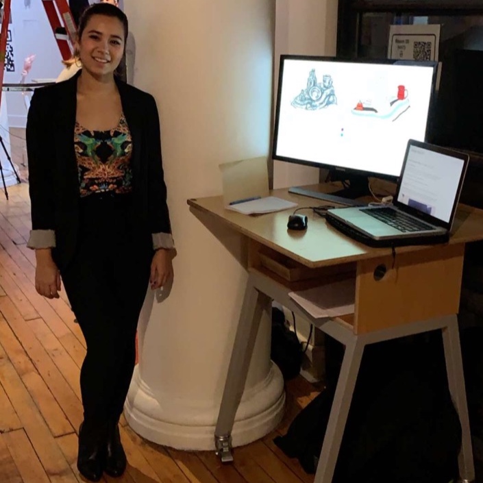
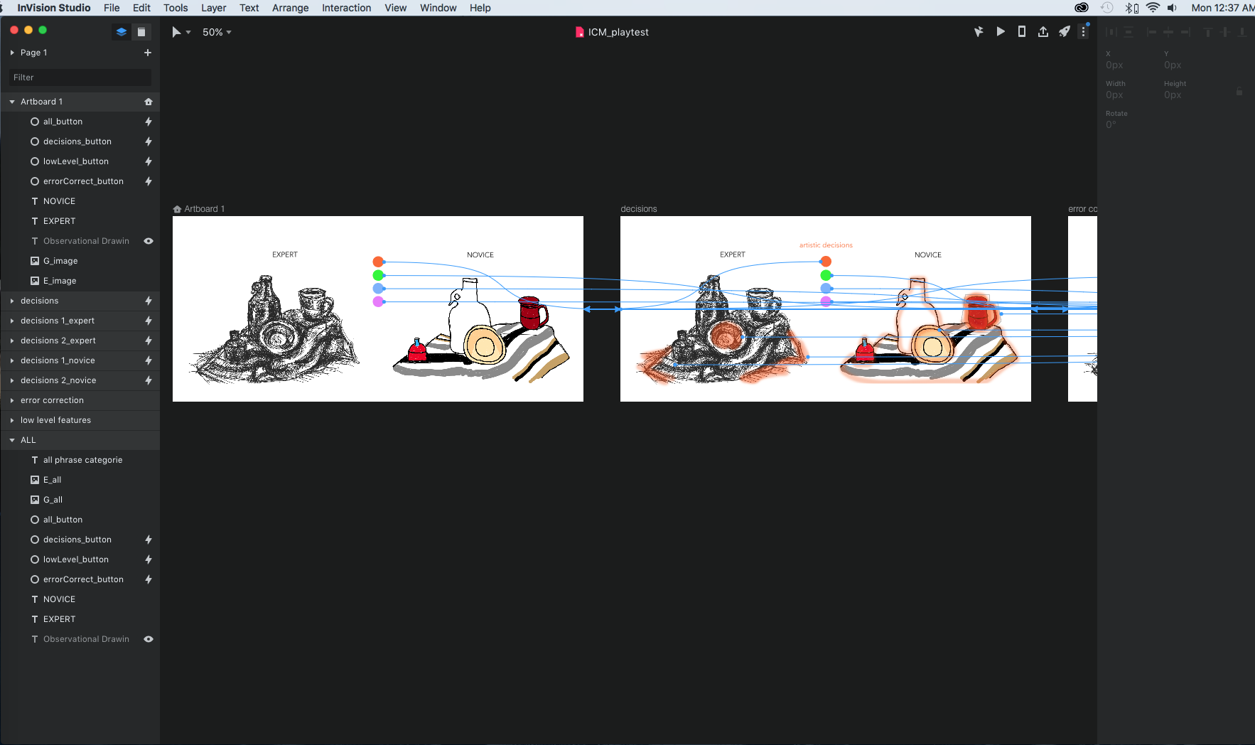
For my final Computational Media project, I presented a data visualization of findings from my undergraduate thesis, where I conducted a protocol analysis experiment. Participants drew a still life from observation while voicing their thoughts allowed. The participants were categorized as either expert or novice categories based solely on their experience with formal visual arts education.

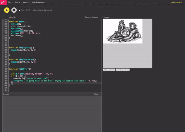
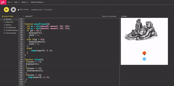
To interact with the data visualization:

  • Click the colored circles to change the category of thought.

  • Roll the mouse over parts of the drawings to see the participants’ thoughts.

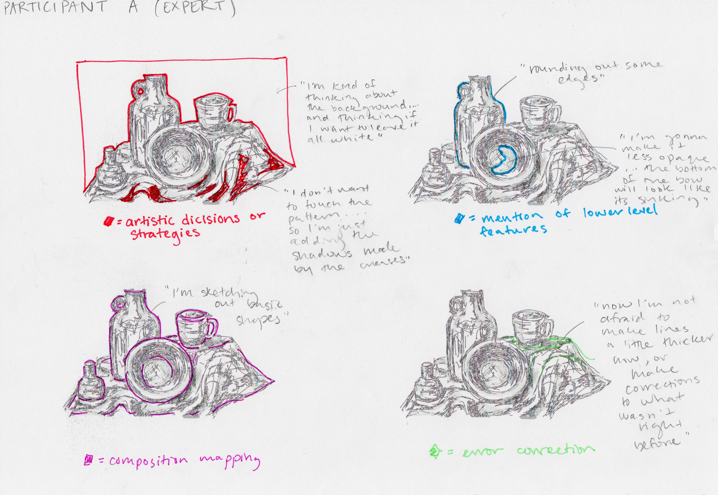
“Artistic decisions” refers to conscious decision making by the participants, this includes aesthetic choices and approaches to their drawing process.

“Lower level features” talks about the details of human vision: edges, shadows, color, etc. These lower level features are processed by the brain automatically, but artists are often told to look at these features specifically when drawing from observation. I wanted to highlight when the participants talked about it to see if we could learn more about the visual perception of artists.

Original stimulus

Original stimulus

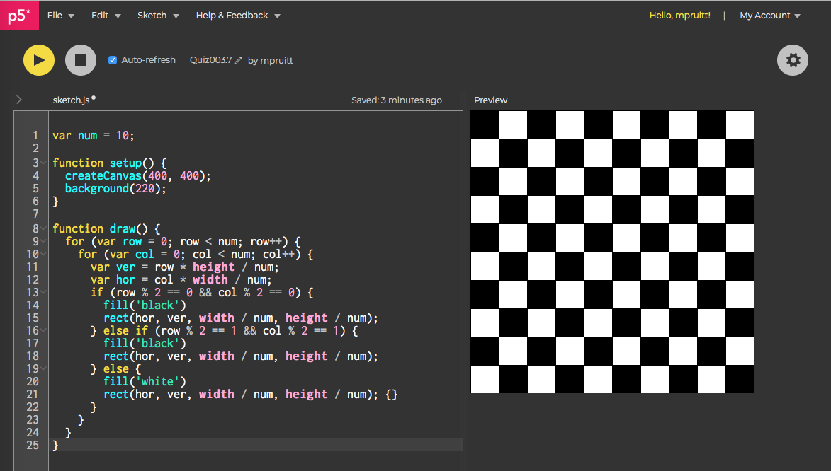
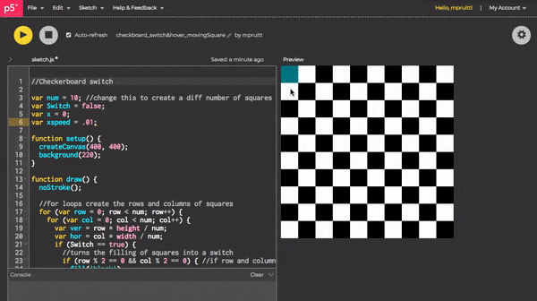
How? This data visualization was built using javascript, specifically the library p5.js and can be used on any web browser. It features images from the actual cognitive science study and thesis “Beyond Seeing: Differences Between Expert and Novice Artists in Observational Drawing.”

Why? Besides being a project about computer programming and learning to code better, “How Do Artist's Think?” was an exploration of our methods for communicating scientific research. There is often a disconnect between the researchers and the potential reach of their work. It is difficult to present findings to those not in same field of study. I saw this as an opportunity to use technology as a means to make my research more accessible. In addition, I sought to learn how data visualization can bring to life qualitative or intangible processes like thought.

I got some really wonderful feedback about next steps at the ITP Winter Show, including creating a interactive directory attached to the actual thesis paper, using it in museums, or allowing participants to draw. On a specific level I want to expand it out with my data, but I also love the idea that something like this could be useful for other scientists.

Read more about the process of creating “How Do Artists Think” with the links below:


wintershow1.png
edited.jpg
IMG_3203.jpg
IMG_3156.jpeg

Photos from the ITP Winter Show 2018.

RETURN TO PORTFOLIO


Final Project Progress: CODE by Maya Pruitt

Starting to code things was the scariest part. I always feel like I conceptually understand how my ideas can translate to code and algorithms, but I have a hard time feeling comfortable executing it. Breaking down my concept into tiny interactions really helped me move past this uncomfortable feeling.

I started by making my category buttons (overlaying a different image onto of an existing one) using preexisting DOM elements.

category_buttonTest.gif

Next, I thought about rollovers. How can I make the sketch change with mouse position. I found it a bit intimidating to add to my sketch, so I took a step back and made generic rollovers based on stuff we had done in class.

Generic rollover 1: mouse changes the background to black or white based on x position.

Generic rollover 1: mouse changes the background to black or white based on x position.

Generic rollover 2: Making the computer aware that the mouse is positioned over the circle.

Generic rollover 2: Making the computer aware that the mouse is positioned over the circle.

Adding the rollover concepts to my sketch. I created an invisible circle over the bowl in the drawing to create a boundary.

Mouse is aware of when it is positioned over the bowl.

Mouse is aware of when it is positioned over the bowl.

Although I had successfully made the mouse aware of its position over the bowl, I wanted this to be category specific, i.e. have the console only print that the “mouse is over bowl” when it is in the artistic decisions category and no other time. I got a bit stuck with this, so I decided to try making my own buttons until inspiration struck.

Since I couldn’t figure out how to change the aesthetic of the DOM buttons, I created my own, using mousePressed().

created_buttons_badrollover.gif

To tackle the global rollover problem, I realized I needed to make the computer aware of what image it is effecting. I thought about using states. After each click, the computer is in a different state. Rollover should only be active when only in the correct state.

states_test.gif

I was able to get the rollover to cause the text to appear, but it lingered. I wanted to have the text only display when the mouse is over a certain part. The rollover is symbolic in a sense. I want it to emulate that thoughts are fleeting. These snippets only happened in the moment and only because of the technology are we able to hold onto them. It takes away from this if the text persists.

To solve this issue, I had to create an initial state to be the default image (the drawing without color overlay) as well as a new function that I called reload(). This function refreshes the default image and buttons. This needs to occur over and over again in the draw function or the text will remain on the screen because it was only called once. An unintended and happy result is that the text looks much clearer too.

states&text2.gif

Link to sketch with all working parts thus far.

With all of these main interactions coded out, now it’s time to perfect it aesthetically and build it out!

There is so much more to be done on this project. The data presented is only a mere fraction of the information collected, and aesthetically, I have better ideas (make it bigger, text more readable, better colors, show video….I could go on forever). However, I really wanted to focus on functionality and get all the pieces up and running and working together. I used the principles of mouseOver and mouseClick functions as a basis for the UI. The exciting thing was learning how to take my vision and actually create it in code. Moving forward I hope to optimize the code, generalize it, and make the project scalable.

RETURN TO HOW DO ARTISTS THINK?

Final Project UX Research by Maya Pruitt

Preparing for a user research playtest was really intimidating for me, because when I conceived the project as data visualization, I didn’t feel that was highly interactive. How does someone interact with a visual representation of data? Yet, as I thought about it, I realized that that is the interaction in and of itself. Making sense of a visualization of data is a type of interaction.

After feedback from my initial presentation, I tried looking at Term Frequency and Inverse Document Frequency (TF-IDF) as a way to compare the transcription data of the participants thoughts. However, I quickly found myself falling into a hole of collecting more data and still not knowing how I would want to visualize it.

I sat down and really wrote out my thoughts to centralize them. What is my main objective with this final project? What kind of data do I already have? I came to the epiphany that mapping the thoughts of my participants to regions of their actual drawings would be a really interesting way to ground the word data. I could further categorize the thoughts to provide an easier way to compare things.

Writing and drawing help me think.

Writing and drawing help me think.

Hand drawn prototype of mapping phrase categories onto a drawing.

Hand drawn prototype of mapping phrase categories onto a drawing.

Making the prototype in InVision Studio.

Making the prototype in InVision Studio.

GIF of the InVision Prototype.

GIF of the InVision Prototype.

I made a prototype in Invision to get a sense of how I’d want to replicate my hand drawn work digitally.

UX RESEARCH

For the first few playtests, I provided no instruction and purely observed. I noticed that clicking the mouse was intuitive, but rollover/mouse hovering not as much. However, with a simple prompt that clicking and rolling over were possible interactions, users seemed to get it right away. It was exciting that most users understood the concept after interacting with it and didn’t need that much explanation.

When I began an interview style of research, I received really amazing feedback.

“What does it mean to you?” I asked.

“How people make decisions based on how they are taught to look at things”

“learning how they think”

“juxtapositions between novice and expert”

“I feel like i’m watching them draw and think out loud. It’s very personal.”

“Reminds me of my experiences with drawing”

Users began to form their own conclusions about the differences between expert and novice even with the limited information in my prototype, which was really exciting. I got some awesome suggestions: adding an image of the original stimulus, making text more obvious, turning it into a learning tool where users could submit their own drawings and thoughts to compare to past participants, etc.

The playtest was incredibly informative and reassured me that focusing on this piece of data visualization was a good place to start. Since it is easy for my ambition to run wild, I had to constantly remind myself to start with a small and achievable objective to build from. I needed to make a plan.

Based on my prototype, WHAT interactions do I need to start coding?

  • Category buttons: a button (upon mouse click) that changes the overlay on the image to indicate what category of thought you’re in

  • Text Rollovers: when the mouse is placed on a particular region of the image, text will appear (category dependent)

HOW do I make them? I wrote out some pseudocode:

if [ARTISTIC DECISIONS category]{
   if [mouse is in region 1]{
      text(“specific text”);
   } 
   if [mouse is in region 2]{
      text(“specific text”);
   } else{
     display no text}
}

Although, I suspected this plan would change immensely, it helped me find a place to begin and initiated my ideas of how the final visualization would have to be organized.

RETURN TO HOW DO ARTISTS THINK?

Final Project Proposal by Maya Pruitt

EXPLORING DATA GATHERING AND DATA VISUALIZATION

Based on my undergrad Thesis - Beyond Seeing: Differences Between Experts and Novices in Observational Drawing

I collected A LOT of data, and different kinds:

  • videos of the drawings themselves

  • in-process screenshots

  • audio files of the participants’ thought processes

  • transcriptions of said audio files

  • image difference statistics

  • time (for total drawing , to map objects)

Example of word data. These are different phrases from the transcriptions categorized by a topic of my choosing with expert or novice status indicated.

Example of word data. These are different phrases from the transcriptions categorized by a topic of my choosing with expert or novice status indicated.

Can I visualize this word data? Can I improving upon the presentation of common phrases/repeated words/similarities in thought processes?

After presenting my ideas in class, I was encouraged to start with counting the frequency of certain words. I like this suggestion, but my hesitation is that I had already done word counts for this project and found the results were not very revealing. Data visualizations like word clouds can definitely demonstrate word frequency but don’t really tell you the relationship between words, which if I’m trying to present the inner thought processes of my participants, this might not be very illuminating.

BUT it is a good way to start. Maybe I can add and interactive element where rolling over a word can show you actual phrases of the participants? Or the fact that it is a comparison between expert and novice may add more interest

word cloud.jpg
Cloud-1.jpg

What I would ideally like to do is a second experiment….or at least set myself up for a second experiment. For part two, I would like to look at how Expert & Novices might view art differently.

Prediction: Expert are more likely to imagine how an artwork would have been made and visualize the process

I thought an interesting way to do this would be to use EYE TRACKING! → Would like to have people look at artworks, & log their eye movements onto a sort of map….I think the outcomes for the two groups may look very different and would be fun to compare

However, feedback in class seemed less enthused about this…so maybe its not a good idea or there isn’t enough time.

Who's it for?

Myself and anyone interested in the mind of artists drawing from observation

How will people experience it?

Visually seeing data instead of reading a 75 page thesis.

Is it interactive?

Possibly.

Is it practical? Is it for fun? Is it emotional?

It is practical, hopefully the visualization presents information clearly.

Is it to provoke something?

Educate more than provoke. My hope would be to communicate a topic I feel passionate about in an interesting way that makes people consider the effects of skill learning in the arts.

RETURN TO HOW DO ARTISTS THINK?

WEEK 8: SKETCHING WITH EXTERNAL MEDIA by Maya Pruitt

This week, I wanted to do something a little silly. Using microphone input and external images, I thought it would be kind of funny, if the user’s voice could move a mouth on an existing image.

I used the iconic meme legend himself, Mr. Bubz and gave him a human mouth, by loading different images into p5.js.

Creating microphone input, was surprisingly the easiest part of this project. Following Dan’s tutorial it was pretty straightforward creating a mic object, starting it, and retrieving the volume value by using getLevel(). These functions were similar to the FFT ones I used last week in that to analyze sound in a certain way, you need o create a specific p5 object from the sound library, initialize it (start vs. analyze) and then can used a more specific function to retrieve data (getEnergy() vs. getLevel()).

The challenge came in creating a realistic mouth to move to the volume of microphone input. I started by using an ellipse to represent the mouth, but I didn’t like how awkward it was. This led to uploading a second image and delving a little into the 3D modeling functions. I thought if I could map the mouth to an ellipse that would give me more control. I wasn’t sure if I could just use map() though, so a friend suggested texturizing an ellipse.

I only wanted the height of the mouth image to move to emulate opening and closing in a funny way, so I added the volume of the mc input to the height of the teeth image.

However, this distortion is really off and now the mouth seems to grow on an diagonal. I’m not sure what is causing this. Maybe there is an actual distortion function that would be better? How can I fix this?

Check out the sketch here.

WEEK SEVEN: DATA VISUALIZATION by Maya Pruitt

This week’s assignment was to create a sketch that uses an external data source.

For a while now, I wanted to create a visual that changes to the rhythm of music, so this seemed like the perfect opportunity to play with that.

Music is data.

An mp3 file compresses sound sequences into a digital format. If we parse through this sequence we can extract really interesting information. When we think of music, we can often break down the sounds we hear ourselves, the heavy deep notes are the bass, the higher notes are called treble, we can distinguish the sounds of different instruments versus vocals, etc.

My goal was to have my data visualization represent these different parts of a song and change with the song as it played. It is kind of an ode to the familiar visual of audio meters.

maxresdefault (6).jpg

By consulting the p5 sound API, there is a perfect function to parse through the data of an mp3 file: p5.FFT or Fast Fourier Transform. FFT is an algorithm that analyzes sound and can isolate individual audio frequencies.

In addition, the function getEnergy() returns the value of the energy/volume of a specific frequency. There are even 5 predefined frequency ranges: bass, lowMid, mid, highMid, and treble.

With FFT, fft.analyze(), and getEnergy() I could begin breaking down the parts of any given song. Place these functions in the draw() loop and they constantly break down and return frequency values as the song plays.

For the visualization part, I wanted to keep it simple. I used the values received from the predefined frequencies to determine the width and height of ellipses. The result is concentric circles (I love me some ripples) that grow and shrink as the song plays. Each frequency range is represented by a different color. It is quite mesmerizing.

Screen Shot 2018-10-23 at 1.30.37 AM.png

I placed the frequency values in order will bass being the outside circle and treble the inside, because the values of the frequency range increase as the notes get lower on the scale.

What’s really cool about this visualization, however, is that you don’t necessarily need to know anything about music to understand what’s happening. It’s kind of fun to focus in on a part of a song you hear and see what circle corresponds to it. To add a little more dynamics, I have the bass circle grow more intensely to emphasize the drops. Something about the synchronization of audio and visual is very appealing. I definitely want to look into some cog sci studies of why that is. Anyway, I digress, link to the sketch below.

Screen Shot 2018-10-23 at 1.32.26 AM.png

Ready to be hypnotized? Check it out here. SOUND ON!

WEEK SIX: THE DOM by Maya Pruitt

Usually I use my blog posts to describe my homework sketches, but I also need to air out some grievances. I found working with the developer tools on the New York Times home page to be extremely frustrating. On one hand it’s very empowering to make changes to an existing site and see it displayed in real time, but with so much content on the NYT site, I found google’s display of the developer tools to be overwhelming. I had a hard time figuring out what parts were even adjustable.

To Mimi, can we do a quick re-review of this and its parts? And maybe discuss the applications of the developer tools, why do programmers use that? What is its true purpose?

Now back to the fun part - this week’s sketch:

Our assignment was to create our own webpage using HTML, CSS, and P5 javascript. This was fun for me, because I got to start to bring to life a design I had done in the past. In the Graphic Design/UX section of my portfolio, you can see my design for ZODIAPP: an app about the Chinese Zodiac. I had sketched out the look of the app and even animated the types of interactions it could have. While there are tools like InDesign, that allow UX designers to prototype these interactions for user testing, it is a whole new world being able to actually create the code behind them. This assignment allowed me to do just that!

Original design

Original design

Translating into HTML

Translating into HTML

We had a few parameters to meet:

  1. Pre-defined HTML Elements

  2. Pre-defined CSS Styles

  3. HTML Elements generated by your p5 sketch

  4. Some kind of mouse interaction with an HTML Element using a callback function you write.

1. I used a bunch of pre-defined HTML elements, such as <div> <h3> and <font>. These elements allowed me to create the navigation bar at the top and gave me quite a bit of control. I could change the font color to white, as well as type the actual text to display. H3 gave me a default size that I liked best. Fun fact: spaces won’t change the way text displays. If you want actual white space, say in between each phrase in a navigation bar, you can use the special characters “&nbsp”.

<img id="logo" src="zodiapp_logo.png" />
<div id="navbar">
  <h3> <font color="white"> Horoscope &nbsp &nbsp &nbsp Story of the Zodiac &nbsp &nbsp &nbsp Animal Gallery &nbsp &nbsp &nbsp 2018</font>
  </h3>
</div>

(lines 11-15 in index.html)

I also used the predefined <img> element to load my logo image.

2. CSS styles allowed me to give properties to the HTML elements I created. For example, this is where I could give the navigation bar its background color and center align the text. In addition, I could modify the logo image. I learned a cool trick that if you want to adjust the scale of an image, you can set one dimension to a specific value and then the other dimension to “auto”. This will maintain the original dimensions of the image and prevent any weird stretching. Lastly, I set the entire background color of my webpage here.

html, body {
  margin: 0;
  padding: 0;
  background-color: #f9f4d9;
}

#logo{
  width:200px;
  height:auto; 
  /* auto keeps the dimensions of the original image*/
}

#navbar{
  background-color: gray;
  text-align: center;
}

(lines 1-16 in style.css)

3. It is also possible to create HTML elements within p5 itself, which allows for a whole different set of controls. It makes sense to generate HTML elements with p5 if you want to manipulate them in some way, so createButton() seemed perfect for this. In addition, I created the footer in p5. I thought this would give me more control for customizing the div element, but I couldn’t figure it out as easily as I did the HTML way. However, in the future if I wanted to create rollover (mouseOver() / mouseOut) events with the navigation bar and footer, say highlighting each word to a different color to indicate a link, maybe p5 would be the best place to create these elements.

  let button = createButton("SPIN");
  button.position(20,110);
  
  let footer = createDiv("About | Help | Contact Us");
  footer.position(275, 850);

(lines 12-16 in sketch.js)

4. Creating the mouse interaction was my favorite part because making a wheel of zodiac animals spin has been a part of my concept for this since day one. My goal was to have the wheel spin when the mouse clicked on the button. Here is where javascript ties it all together and puts an animated element on the webpage. I uploaded another image into the sketch.js file using the preload() function. I created a function called spin() which creates the spinning behavior. In order to get the button working correctly, I had to create a toggle switch, like we learned with the bouncing ball. This was stored in another function called spinOn(). The button can then use mousePressed to callback to the spinOn() switch function. Ideally I wanted this to look more like: wheel.spin() and button.mousePressed(spin), but I couldn't get it working like that. Would I need to create a wheel class? I’m pretty sure I could make a class for the wheel image and turn it into an object. It would be fun to expand on this in the future to make it more dynamic.

zodiapp_hw_html.gif
428px-DOM-model.svg.png

Oh, also to my non-ITP readers, in case you were wondering, DOM stands for The Document Object Model. It’s a kind of hierarchal way of organizing website programing/HTML . But to me “The DOM” sounds like a fancy ass queen, which is why it seemed like a sufficient title. k Yamz out.

Try dat spin button for yourself here.

WEEK FIVE: ARRAY SAVES THE DAY! by Maya Pruitt

This week was especially exciting because I finally got to create the program I originally conceptualized in week two. Learning arrays is what truly made this vision possible, so I was itching to finally implement it.

By creating the ripple class last week, I already understood the concept of constructing objects with distinct properties. I also experimented with creating multiple ripple objects manually, but this was not the main objective.

The time had finally come. An array to the rescue!

With my object class already in place, it was pretty easy to build my program following Dan’s format for his bubble example in video 7.3 Arrays of Objects. This exercised again solidified the importance of order and placement of code within the program. What I mean is that code is quite logical. If I want a new ripple to be created with the click of the mouse, then the constructor code needs to be placed within the MouseClicked function:

function mouseClicked() {
  let ripple = new Ripple(mouseX, mouseY, 0, 0);
  ripples.push(ripple);
}

Here a new ripple is created (at mouseX and mouseY, size of 0 width and 0 height) with each click of the mouse. The ripple object is then stored in the array and placed (“pushed”) to the end of the array.

In a continuous loop, I want the array to grow in length, and I need each ripple object to run (which is just a function containing display() and grow() functions). This translates into a for loop inside the draw() function.

function mouseClicked() {
  let ripple = new Ripple(mouseX, mouseY, 0, 0);
  ripples.push(ripple);
}

Sound on if you want to hear the satisfying click of the mouse!

FINAL THOUGHTS:

Writing about this program and my process here in the blog, makes it sound like building it was so easy, but in reality, it truly took me until this week to really grasp these concepts. It’s crazy how difficult this idea felt at week two…in fact, more than difficult, it felt impossible. Arrays open up the possibilities. While I am super pleased to have finally executed this original idea, I look at it now and think it’s too simple. I tried to spruce it up with minor aesthetic changes, but the future goal would definitely be to create some sort of realism. How do I make real looking water in code?

Interact with my sketch here.

WEEK FOUR: REORGANIZING CODE by Maya Pruitt

This week, our assignment was to revisit past projects and reorganize our code based on our new knowledge of creating functions.

Determined to get the Ripple program running the way I originally envisioned it, I saw this as a good opportunity to expand on it, reorganize it, and set it up for when we learn arrays this coming week.

I chose to make the expansion of the ripple its own function. What is kind of liberating about code is that though there are rules in terms of syntax, or how certain elements are defined, in the end, how we want to do something or what we want to do is up to the programmer. I could have made a modifiable function that takes parameters, or have it do a calculation that returns a value. However, I decided I just wanted a standard rate of growth, so the resulting function looks pretty simple:

 grow() {
    this.rw += 2;
    this.rh++;
  }

The cool part is that now any shape can have grow applied to it. Check that out here.

To challenge myself, I created a Ripple class. I know this will serve me in the long run, because the goal is to create a new ripple object with each click of the mouse.

Defining what it means to be a ripple:

class Ripple {
  constructor(clickX, clickY, rw, rh) {
    this.clickX = clickX;
    this.clickY = clickY;
    this.rw = rw;
    this.rh = rh;
  }

  display() {
    noFill();
    ellipse(this.clickX, this.clickY, this.rw, this.rh);
  }

  grow() {
    this.rw += 2;
    this.rh++;
  }
}

With the class I am able to make multiple ripple objects. However, because the position of a ripple is determined by a mouse click, there is no way now to make two different ripples starting at different positions or different times of growth. In other words, ripple size is modifiable (fig.A) and position only if ClickX or ClickY is changed with equation. The former will show two ripples inside one another, and the latter scenario will have two ripples grow at the same time in different locations.

Fig A. Line 32 &amp; 33 show two ripple objects, the only difference between them is the size of ripple width and height. This creates concentric ripples upon a mouse click.

Fig A. Line 32 & 33 show two ripple objects, the only difference between them is the size of ripple width and height. This creates concentric ripples upon a mouse click.

Fig B. Line 33 indicates that position is being modified when clickX and clickY are multiplied by two. This causes both ripple objects to appear at the same time, but at different positions with the click of the mouse.

Fig B. Line 33 indicates that position is being modified when clickX and clickY are multiplied by two. This causes both ripple objects to appear at the same time, but at different positions with the click of the mouse.

Final thoughts:

Location, location, location! This applies to code as well. My biggest take away from this week is that where functions are placed in the program truly determines what will or will not happen. Watching Dan’s videos, we see our first example of a class object being run by putting the constructor in the setup() function. I quickly learned that my program wouldn’t run that way. If I want a ripple created when a mouse is clicked, then that is where the constructor function should be placed – inside mouseClicked! A simple order change can be a determining factor too. This reinforces why having variables at the top makes sense. The computer won’t be able to use variables if i doesn’t know what they are, or what they have initially been set to.

I constantly have to remind myself that the computer doesn’t think like a human does. So abandon your humanity, it’s the only way to code! Jk jk.

See the final organized ripple program here.

WEEK THREE: CHECKERBOARD SWITCH by Maya Pruitt

Creating an interactive sketch

This week, the challenge was to create our own buttons/roll-overs/ or sliders that then interact or change the sketch.

I had something different in mind, but felt the easiest way to accomplish the above tasks, was to combine different things we’ve learned and practice.

I started by creating a grid like in our quiz, but with squares instead of lines, so I could fill portions of it and create a checkerboard. My variable names were really important here, because they helped be sort out how to think about the grid. I didn’t want it to just be x and y when we’re dealing with rows and columns. In addition, it is important to note that the for loops create rows vertically and columns horizontally. The num variable allows you to change the number of squares in the gird (num x num).

Including mod was a cool breakthrough. I knew the best way to alternate fill was to identify which squares were in an even or odd position for both row and column. Mod does just this. If a number is mod 2 (N%2) == 0 this means that after being divided by 2 there is no remainder. Even numbers divided by 2 leave no remainder. Conversely, odd numbers will create a remainder of 1 ( N%2 == 1). This set the rules for my conditional statements. It took a couple tries and a couple if statements to make the whole grid cooperate with these rules.

Just a condition to fill when row and column are both even.

Just a condition to fill when row and column are both even.

But the board should also fill when row and col are both odd.

But the board should also fill when row and col are both odd.

Creating a button:

Using what we learned about toggle switches, I thought an easy interaction with the checkerboard, would be to make the checkerboard switch its configuration upon a mouse click – turn what were black squares into white squares and white squares to black squares.

Inside the for loops, I had to create a sort of “state” condition. If the switch is on, fill this way, if it is off, fill the opposite. This concept allowed a lot of copying of code with minor changes. I think its a good way to see how the loops really work.

Inside the mousePressed () function, I indicate where the mouse should be in order to turn on/off this switch. So essentially this creates the button.

checkerboard_switch.gif

Creating a hover/rollover:

Although the sketch at this point had a button, I wanted to create another visual cue that the top left corner square is indeed the button. I did this by turning it into a rollover as well. The top left square changes color when the mouse is placed over it, but only switches the checkerboard if clicked. This whole piece had to be placed outside the for loops and required the addition of identifying what row and column the mouse should be in in the conditional statement, otherwise the whole board filled.

Bad teal fill.

Bad teal fill.

Adding the parameters of row == 0 &amp;&amp; col == ), keeps the teal fill within the top left square.

Adding the parameters of row == 0 && col == ), keeps the teal fill within the top left square.

Interact with the checkerboard switch with teal hover button here.

Adding animation:

I wanted the mouseclicked button to stimulate some sort of movement, but I wasn’t sure how to incorporate this. In fact, adding in the animated part was the most difficult part for me. It was hard to figure out where in the for loops to place it, which is why I ended up borrowing our bouncing ball code (lines 37-41) from class and just plopping it in the program until I could see a moving square.

checkerboard_moving square.gif

Try checkerboard switch with moving square for yourself here.

Final thoughts:

Moving forward, I would like to more logically attempt the animation. Maybe have the square move to the right from the top left, row by row leaving a trail and filling the whole sketch a different color. I can picture where to place movement so that it moves to the right along one row, but I’m not sure how to get it to drop down the the next row and continually do that. My instinct is that it would go inside the nested for loop, because the loop already makes both rows and columns. However, that is also where the issue lies, because on top of creating the grid, I want to make another moving square. My brain hurts just thinking about this.

Final final thoughts:

I am struggling with programming right now. I can see the creativity in it and the potential to make such interesting things. But if I have an idea, I often don’t even know how to begin turning it into code. It feels like instead of being a tool for me, it’s a hinderance. Hopefully with more practice and knowledge, this will go away. It’s truly a different way of thinking because I have to “make” within certain rules and parameters.