Preparing for a user research playtest was really intimidating for me, because when I conceived the project as data visualization, I didn’t feel that was highly interactive. How does someone interact with a visual representation of data? Yet, as I thought about it, I realized that that is the interaction in and of itself. Making sense of a visualization of data is a type of interaction.
After feedback from my initial presentation, I tried looking at Term Frequency and Inverse Document Frequency (TF-IDF) as a way to compare the transcription data of the participants thoughts. However, I quickly found myself falling into a hole of collecting more data and still not knowing how I would want to visualize it.
I sat down and really wrote out my thoughts to centralize them. What is my main objective with this final project? What kind of data do I already have? I came to the epiphany that mapping the thoughts of my participants to regions of their actual drawings would be a really interesting way to ground the word data. I could further categorize the thoughts to provide an easier way to compare things.

Writing and drawing help me think.
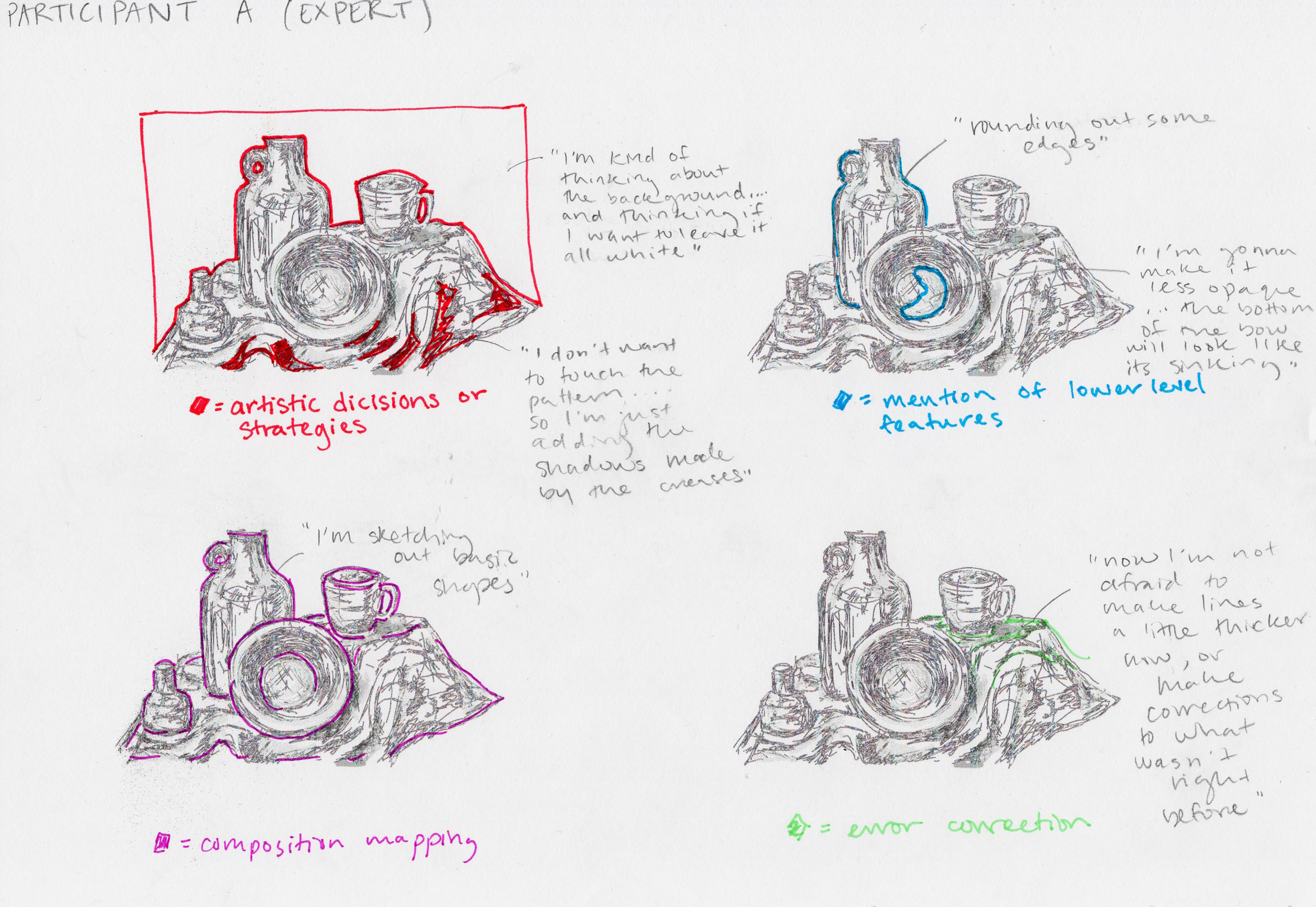
Hand drawn prototype of mapping phrase categories onto a drawing.
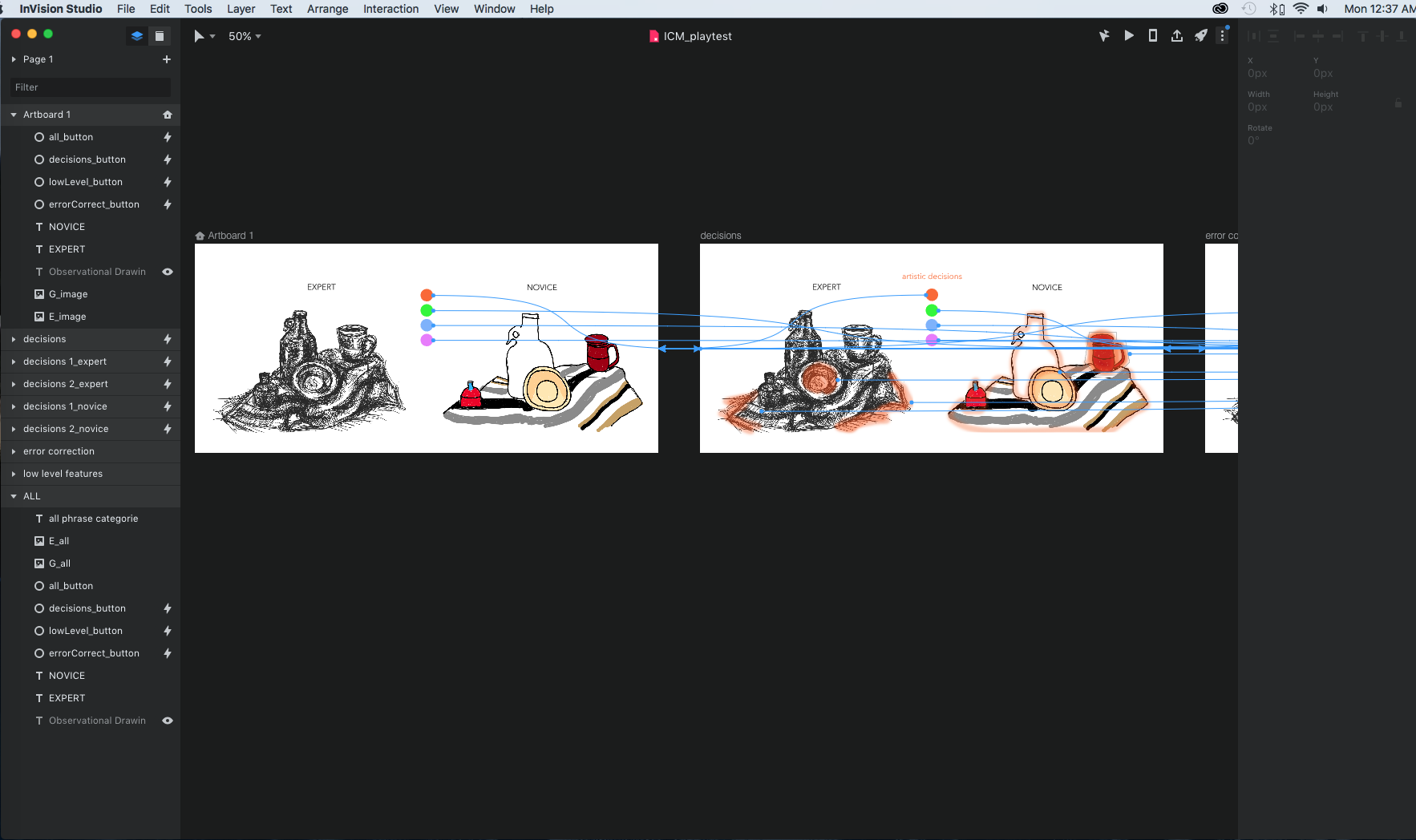
Making the prototype in InVision Studio.

GIF of the InVision Prototype.
I made a prototype in Invision to get a sense of how I’d want to replicate my hand drawn work digitally.
UX RESEARCH
For the first few playtests, I provided no instruction and purely observed. I noticed that clicking the mouse was intuitive, but rollover/mouse hovering not as much. However, with a simple prompt that clicking and rolling over were possible interactions, users seemed to get it right away. It was exciting that most users understood the concept after interacting with it and didn’t need that much explanation.
When I began an interview style of research, I received really amazing feedback.
“What does it mean to you?” I asked.
“How people make decisions based on how they are taught to look at things”
“learning how they think”
“juxtapositions between novice and expert”
“I feel like i’m watching them draw and think out loud. It’s very personal.”
“Reminds me of my experiences with drawing”
Users began to form their own conclusions about the differences between expert and novice even with the limited information in my prototype, which was really exciting. I got some awesome suggestions: adding an image of the original stimulus, making text more obvious, turning it into a learning tool where users could submit their own drawings and thoughts to compare to past participants, etc.
The playtest was incredibly informative and reassured me that focusing on this piece of data visualization was a good place to start. Since it is easy for my ambition to run wild, I had to constantly remind myself to start with a small and achievable objective to build from. I needed to make a plan.
Based on my prototype, WHAT interactions do I need to start coding?
Category buttons: a button (upon mouse click) that changes the overlay on the image to indicate what category of thought you’re in
Text Rollovers: when the mouse is placed on a particular region of the image, text will appear (category dependent)
HOW do I make them? I wrote out some pseudocode:
if [ARTISTIC DECISIONS category]{ if [mouse is in region 1]{ text(“specific text”); } if [mouse is in region 2]{ text(“specific text”); } else{ display no text}}Although, I suspected this plan would change immensely, it helped me find a place to begin and initiated my ideas of how the final visualization would have to be organized.