Music Interaction Design Prompts by Maya Pruitt

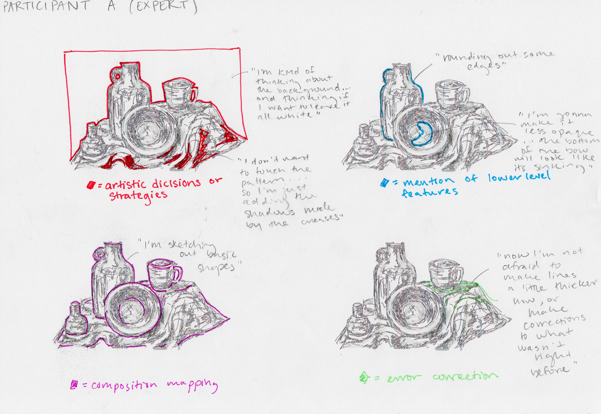
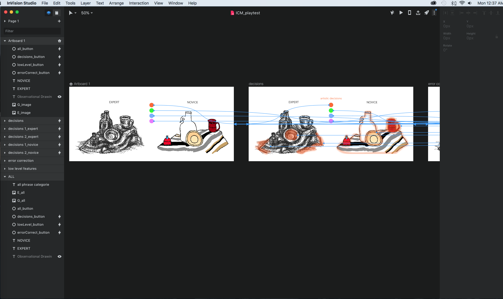
A brief description of the concept that includes what it does, who it is for, and where it lives (not more than a couple of sentences)

  • A drawn sketch (or sketches) that indicates form, materials, scale, and interaction

  • The song you started from

  • The oblique strategy you got

“My Boy” by Billie Eilish

Basic catalog of attributes:

  • Key: B minor

  • bpm: 90

  • drums, female vocal’s (breathiness), “ghostly sound”, synth, harmony

Random oblique strategy: “Make something implied more definite (reinforce, duplicate)

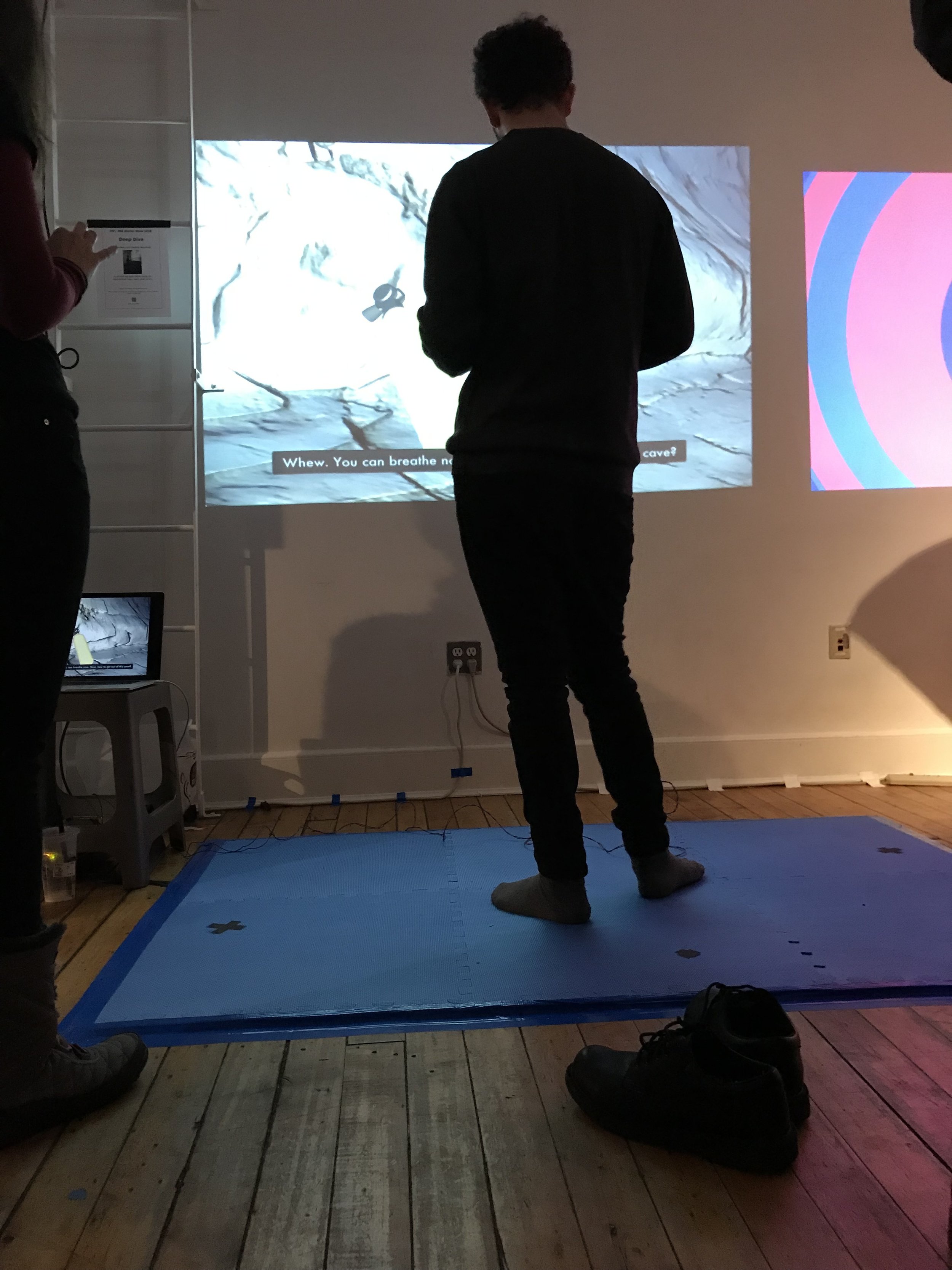
Kemi and I imagined that we work for Billie Eilish and her team. We created an installation with a supplementary mobil application. The installation features a large touch screen that with squares that highlight different aspects of Eilish’s music, emphasizing the implications of her sound. Touching the center would showcase the original sound, and moving outward to the corners breaks it down into components of what created that original sound.

We also discussed having the user input their own sounds, either speaking or singing, and have our device modify it, almost like a filter, to sound like these parts of her music.

IMG_4286.jpg
IMG_4285.jpg


2. Write a project prompt for yourself. You will use it to frame subsequent assignments, but it can evolve/change later. Submit it here.

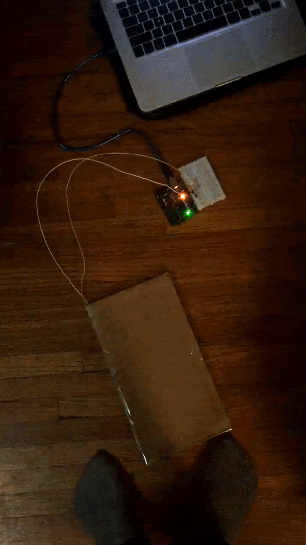
Build a tool that allows one person to sound like many: I am thinking of a machine of some kind that would allow the user to sing into it and have the output harmonize with them, kind of like a one-man a cappella group.

Design a visualization of sound: For this I imagine two possibilities. 1) In my collective play course we are using web sockets. I see this as an awesome opportunity to have multiple clients input to/modify a collective outcome. I imagine singing produces colorful fuzzball that combine and mix color based on harmony. 2) this could also serve as a teaching tool for singers perhaps displaying perfect pitch versus the users so they can learn how to match it.

Create an installation that plays with the principles of acoustics: Not exactly sure what to do with this, and I’m not sure what its called, but some places are designed so if you stand in one part of a room you can actually hear what’s happening in a completely different part of the room.

DEEP DIVE: A Virtual Underwater Escape Room by Maya Pruitt

Narrative: You have fallen into the ocean and are now trapped in an underwater cave. By finding a light, breathing apparatus, and a helpful sea creature you may get out alive, but you only have 6 minutes. Can you escape?

How? The game was designed in Unity. Graphics are projected onto a wall. A physical foam floor pad with embedded switches controls the game play when stepped on it. A button on the goggles is another controller used to manipulate parts of the game. The floor and button electrical components are powered by an Arduino and serially communicated with Unity to create a cohesive working system. On screen prompts and sound guide the players to the finish.

Why? Deep Dive was an exploration of game design, virtual reality, and immersive environments. We wanted to take gameplay out of a headset and create a more communal experience. How do game dynamics change if you are untethered? If other people are watching? Because it was a physical computing project, our number one goal was to allow the body to move freely and encourage physical interaction from the participants. Our controller was designed to expand from just a small handheld device, a screen, or a small dance dance revolution style floor, and grant our participants the opportunity to walk MORE. We believed that this type of physicality would enhance the exploration of the environment.

Read more about the process of creating “Deep Dive” through the links below:

IMG_3178.jpeg
IMG_3201.jpeg
The Deep Dive team: Dylan Dawkins, Cara Neel, Maya Pruitt

The Deep Dive team: Dylan Dawkins, Cara Neel, Maya Pruitt

PComp Final Progress: Component Iterations by Maya Pruitt

This project demanded a interconnectedness between the physical and the virtual. It was a complicated balance and a long process. Below I try to breakdown the steps, the division of our labors, and the process of iteration for each component of Deep Dive.

CREATING THE INTERACTIVE FLOOR:

After the first play test we began construction of better plate switches. We used two layers to keep it flat. Our goal was to make the switches barely noticeable under the feet so users would have “stumble across”, so to speak, the game controls.

Version 1: Our first iteration of the floor pad used chip board (a non-corrugated cardboard) of different thickness. We used a thin chip board to lay on the floor underneath the mat. In certain areas we taped a layer of tin foil, stacked a stiffer chip board frame over it, and then added a tin foil on the underside of the mat.

Result: The tinfoil sections kept touching creating constant signal. We needed to create a thicker separation between the pad and floor. Luckily, we purposefully used tape early on to account for future adjustments.

Laser cut design of plate switches

Laser cut design of plate switches

Laser cut chip board pieces. The “Frame” shape was key.

Laser cut chip board pieces. The “Frame” shape was key.

Version 2: For our next playtest we glued all components down, and soldered our connections to a perf board.

Result: Eventually the tinfoil began to tear and it was quite cumbersome having everything wired together with two separate layers that had to be aligned exactly.

Breadboard —>

Breadboard —>

Solder —>

Solder —>

Perf Board.

Perf Board.

Version 3: For our final version, which was for the winter show, we knew we needed to seriously amp up the robustness. We purchases thin aluminum sheet metal because it is conductive, and we could easily cut it to size. We maintained the original tinfoil on chip board layer, glued the chip board frames on top, and then glued the sheet metal on top of that. This allowed us to have the mat completely separated from switches and we could even alter their position under the mat if we wanted.

Result: We did have one issue where hot gluing connections to the sheet metal actually ruined its connectivity, but using tape was a quick fix. In the future, it should be soldered. Overall, it held up really well during the two-day show.

noMat_plateSwitches.JPG

HOW DO YOU LIKE THEM BUTTONS?

After all our playtests, we realized getting people to touch the wall was really difficult. Do we have to make an obvious button? Are we trying to hide it so it still looks like a wall/the projection over it? We had a lot of questions about how to make this button effective. By a sort of happy accident, we created small plate switches that users had to end up holding during our tests, so we ultimately decided that it actually worked quite well. Players never questioned holding a device (even if it was tethered), because it’s quite natural in gaming. Cara came up with the idea to put it on “scuba goggles”. The goggles are not functional, merely an enclosure for the button, but it made it more fun, and fit perfectly into our story.

Floor mats are fun.

Floor mats are fun.

Button on the goggles turns on a light, I swear.

Button on the goggles turns on a light, I swear.

WORLD BUILDING IN UNITY:

Design of the world was conceptually thought out by all of us and then executed by Dylan. We knew we wanted a cave underwater with a tunnel to the surface. We had some iterations, in terms of figuring out how best to create the world and how it would be navigated. At first we thought perhaps each hidden object was located in a different scene, but ultimately settled on keeping the same environment and shifting view within it to find objects. A change in environment happens when you start on the surface and when you go through the tunnel at the end back to the surface (overall image of the model was developed in version2).

Version 1: As shown in our first playtest, the world was just the basic Unity demo with floating objects. For the true version 1, Dylan began to play around with water prefabs and the aesthetics of above and below the surface.

Version 2: The model of the world was created in Maya with a rock texture added. Using effects like fog created an underwater feel. For our initial runs, some of the objects, like the light, were only place holders.

Yellow sphere place holder for a light source. Notice the fog element that make the cave especially dark and difficult to orient.

Yellow sphere place holder for a light source. Notice the fog element that make the cave especially dark and difficult to orient.

Overall shot of the world. A tunnel from the top is where players initially fall into, the cave below is the main environment to be explored to find objects. Another tunnel leads outward for the final escape to the surface.

Overall shot of the world. A tunnel from the top is where players initially fall into, the cave below is the main environment to be explored to find objects. Another tunnel leads outward for the final escape to the surface.

I played around creating assets in Blender, attempting 3D modeling for the first time. Ultimately, my coral didn’t make it into the final piece, but it was a good exercise for me.

Coral inspiration.

Coral inspiration.

Rendered 3D coral model

Rendered 3D coral model

coral_inblender.gif

SOUND DESIGN

I felt sound was crucial to the underwater ambiance for our project, so I took the lead on creating a narrative soundscape. I thought about how to make it most realistic, selected the sound clips, and mapped out where to place them in the story (for example what sounds are continuous vs. which are triggered by events), as well as how to apply them in the Unity code. Sound became an extremely useful device to create cues to players about what was happening as well as instilling emotion, like for a win versus a loss.

Pseudo code for sound placement.

Pseudo code for sound placement.

Version 3: For our final Unity version, play through streamlined, all assets were in place (such as a real light source), on-screen text prompts were added, and the sound design was implemented.

3D ANIMATION & UNREAL ENGINE by Maya Pruitt

This last animation project was a huge challenge, but also really exciting to get a taste of 3D animation.

Using Adobe Fuse, we created humanoid characters using customizable presets. We then uploaded this character to Mixamo to find animations.

In Unreal Engine we began building our 3D environments. This was the hardest part for me, just orienting myself in the 3D modeling space was a challenge. Gaming engines are powerful pieces of software, so the majority of my feelings of being stalled was not from lack of ideas, but from fighting with the program.

Most of my problems came from having to work on different production laptops at school and not knowing how to save properly. Unreal Engine allows you to save different parts within one larger file, so I think that’s what tripped me up. In addition, I tried to continue from the file we began in class since animation imports were successful. Despite having only one skeleton, I couldn’t get the new animations to sync with it, and they keep looking like jumbled messes.

WHAT A MESS. WHERE ARE HIS BONES?

WHAT A MESS. WHERE ARE HIS BONES?

Ultimately, I had to start from scratch and reestablish a better workflow right from the beginning. By that time, I had already developed my brief story about an Ogre that is tired of the brutish nature of his species and just wants to be a graceful dancer.

My greatest discovery in Unreal was the ability to change weights of the animations, this allows you to blend them more seamlessly together like an ease in/ease out sort of thing. I could even add static poses and animate them this way to fit into the sequence.

While, I felt like I was cheating a bit using pre-made assets, I found the creativity came is how the narative was formed, building the world, and using interesting camera angle to lead the story.

In the future, I would love to delve more into how to create creates, rigging them in 3D, and then creating those animations myself!

The final project is a solo effort showcasing this Ogre and his big dreams.


How do Artists Think? by Maya Pruitt

For my final Computational Media project, I presented a data visualization of findings from my undergraduate thesis, where I conducted a protocol analysis experiment. Participants drew a still life from observation while voicing their thoughts allowed. The participants were categorized as either expert or novice categories based solely on their experience with formal visual arts education.

To interact with the data visualization:

  • Click the colored circles to change the category of thought.

  • Roll the mouse over parts of the drawings to see the participants’ thoughts.

“Artistic decisions” refers to conscious decision making by the participants, this includes aesthetic choices and approaches to their drawing process.

“Lower level features” talks about the details of human vision: edges, shadows, color, etc. These lower level features are processed by the brain automatically, but artists are often told to look at these features specifically when drawing from observation. I wanted to highlight when the participants talked about it to see if we could learn more about the visual perception of artists.

Original stimulus

Original stimulus

How? This data visualization was built using javascript, specifically the library p5.js and can be used on any web browser. It features images from the actual cognitive science study and thesis “Beyond Seeing: Differences Between Expert and Novice Artists in Observational Drawing.”

Why? Besides being a project about computer programming and learning to code better, “How Do Artist's Think?” was an exploration of our methods for communicating scientific research. There is often a disconnect between the researchers and the potential reach of their work. It is difficult to present findings to those not in same field of study. I saw this as an opportunity to use technology as a means to make my research more accessible. In addition, I sought to learn how data visualization can bring to life qualitative or intangible processes like thought.

I got some really wonderful feedback about next steps at the ITP Winter Show, including creating a interactive directory attached to the actual thesis paper, using it in museums, or allowing participants to draw. On a specific level I want to expand it out with my data, but I also love the idea that something like this could be useful for other scientists.

Read more about the process of creating “How Do Artists Think” with the links below:


wintershow1.png
edited.jpg
IMG_3203.jpg
IMG_3156.jpeg

Photos from the ITP Winter Show 2018.

RETURN TO PORTFOLIO


Final Project Progress: CODE by Maya Pruitt

Starting to code things was the scariest part. I always feel like I conceptually understand how my ideas can translate to code and algorithms, but I have a hard time feeling comfortable executing it. Breaking down my concept into tiny interactions really helped me move past this uncomfortable feeling.

I started by making my category buttons (overlaying a different image onto of an existing one) using preexisting DOM elements.

category_buttonTest.gif

Next, I thought about rollovers. How can I make the sketch change with mouse position. I found it a bit intimidating to add to my sketch, so I took a step back and made generic rollovers based on stuff we had done in class.

Generic rollover 1: mouse changes the background to black or white based on x position.

Generic rollover 1: mouse changes the background to black or white based on x position.

Generic rollover 2: Making the computer aware that the mouse is positioned over the circle.

Generic rollover 2: Making the computer aware that the mouse is positioned over the circle.

Adding the rollover concepts to my sketch. I created an invisible circle over the bowl in the drawing to create a boundary.

Mouse is aware of when it is positioned over the bowl.

Mouse is aware of when it is positioned over the bowl.

Although I had successfully made the mouse aware of its position over the bowl, I wanted this to be category specific, i.e. have the console only print that the “mouse is over bowl” when it is in the artistic decisions category and no other time. I got a bit stuck with this, so I decided to try making my own buttons until inspiration struck.

Since I couldn’t figure out how to change the aesthetic of the DOM buttons, I created my own, using mousePressed().

created_buttons_badrollover.gif

To tackle the global rollover problem, I realized I needed to make the computer aware of what image it is effecting. I thought about using states. After each click, the computer is in a different state. Rollover should only be active when only in the correct state.

states_test.gif

I was able to get the rollover to cause the text to appear, but it lingered. I wanted to have the text only display when the mouse is over a certain part. The rollover is symbolic in a sense. I want it to emulate that thoughts are fleeting. These snippets only happened in the moment and only because of the technology are we able to hold onto them. It takes away from this if the text persists.

To solve this issue, I had to create an initial state to be the default image (the drawing without color overlay) as well as a new function that I called reload(). This function refreshes the default image and buttons. This needs to occur over and over again in the draw function or the text will remain on the screen because it was only called once. An unintended and happy result is that the text looks much clearer too.

states&text2.gif

Link to sketch with all working parts thus far.

With all of these main interactions coded out, now it’s time to perfect it aesthetically and build it out!

There is so much more to be done on this project. The data presented is only a mere fraction of the information collected, and aesthetically, I have better ideas (make it bigger, text more readable, better colors, show video….I could go on forever). However, I really wanted to focus on functionality and get all the pieces up and running and working together. I used the principles of mouseOver and mouseClick functions as a basis for the UI. The exciting thing was learning how to take my vision and actually create it in code. Moving forward I hope to optimize the code, generalize it, and make the project scalable.

RETURN TO HOW DO ARTISTS THINK?

PComp Final UX Research by Maya Pruitt

Playtests are a really important part of developing an interactive device. When you are so close to something it’s hard to know if what you’ve planned actually works for real people.

It was important for us to observe how people would use the plate switches or buttons on the wall and whether or not they felt inclined enough to explore.

PLAYTEST for 11/15/18:

Objective: Discover how people will explore our underwater world

We want to give limited instructions and see how people react.

Do they walk around? Will they figure out how stepping in a certain place changes the world? Can they figure out that certain objects in the world can be manipulated by physical touch?

Set up:

  • 2 plate switches on the floor under yoga mats, hidden in random places. These control the orientation of the projected world (One moves left, one moves right).

  • 1 Plate switch on the wall that changes the color of one object to red when it is pressed and the object is in view.

  • Attach comp to HDMI projector in the classroom to display the Unity world on back wall

Instructions for the user:

“One object in the scene can change visually. Find it and change it.”

Video includes users from Playtest #1 – 11/15 and Playlets #2 – 12/6

OBSERVATIONS/NOTES FROM PLAYTESTING:

  • Figuring out that stepping will move the view of the world was intuitive

  • Pressing the “button” on the wall was not

  • How are we giving directions?

    • Screen prompts? Audio?

  • How do we indicate that the wall is interactive?

    • Outline of hand, obvious button, projection mapping (create panel with buttons behind it)

After our playtest we also finalized our storyboard and created a table to plan out exactly what is happening at each moment.

Screen Shot 2018-11-29 at 11.31.29 AM.png

PComp Final Progress: Initial Steps by Maya Pruitt

To help ideate, Dylan, Cara and I actually went to Escape the Room NYC and tested out their Submarine themed escape room. While our use of technology will be far different, our biggest take away was that it is most fun not knowing what parts of the room are actually meant to be interactive.

We escaped the room!

We escaped the room!

This aspect confirmed our decisions to hide the plate switches on the floor and aim to use projection mapping for items on the wall. We don’t want things to look like obvious buttons in order to encourage exploration and let people “discover” what works as they go.

Cara mapped out the placement of our sensors to look something like this:

Screen Shot 2018-11-29 at 11.06.15 AM.png

I worked on creating our first plate switch out of cardboard and hooking it up to an LED in Arduino as a simple way to test. Stepping on the switch turns on the light.

1stPlateSwitch.gif

Dylan began working on having the Arduino talk to Unity. Using push buttons to represent the plate switches, he made it so that the left and right physical buttons changed the camera view in Unity respectively.

pushButtonsUnity.gif

AFTER EFFECTS ANIMATION by Maya Pruitt

For this animation I worked with Chenyu Sun and Zhe Wang.

I was inspired by images I had seen on Instagram of these impressive art history halloween costumes. I thought it would be interesting to create our animation along these lines, bringing to life ubiquitous masterpieces. Chenyu and Zhe were instantly on board!

Screen Shot 2018-11-28 at 12.51.37 PM.png

We began our process by finding famous images for potential characters, Girl with the Pearl Earring, Van Gogh, Mona Lisa, and The Creation of Adam were some of the first finds. A few early interactions came to mind as well, for instance, I thought what if Frida Kahlo popped Jeff Koon’s Balloon Dog?

Upon looking at Micheangelo’s ‘Last Supper’, Zhe came up with what would be the unifying story line. What if the characters received an invitation to join the last supper hosted by someone other than Jesus?

Yes! We rolled along from there deciding Michelangelo’s David would be our host, along with which characters would be invited and even ones who wouldn’t. We asked questions like how would characters react to not being invited? How does David move about a space to send his invitations? , etc.

We created a storyboard where David decides to invite guests, ignores others, and the animation will culminate with a new version of the last supper.

Thus, the technical making began. Using photoshop we would remove famous masterpieces from their backgrounds and create moveable points (like arms and legs). With After Effects came magic. Using key frames and camera effects, even the simplest movements created character and story.

After Effects screenshot. An example of our teamwork, Chenyu had already animated David walking, and I animated him into the space.

After Effects screenshot. An example of our teamwork, Chenyu had already animated David walking, and I animated him into the space.

We collaborated extremely well as a team. Breaking up the work load, we worked on different scenes separately or created animated assets for others to use.

PLAN:

  • Scene 1: wide view of David in 1museum.jpg & David’s general walking movements (Chenyu), throws invitation to Van Gogh , walks towards seurat (Maya)

  • Scene 2: close up of animated Seurat park painting, David walks by (Chenyu)

  • Scene 3: wide view David walking towards doorway to see American gothic, see his backside (Maya)

  • Scene 4: close up of American gothic, no invitation (Chenyu)

  • Scene 5: invitation thrown to Balloon dog, all balloon versus. Frida stuff (Maya)

  • Scene 6: Birth of Venus (Zedd)

  • Scene 7: Las Meninas (Zedd)

  • Scene 8: Last Supper, start zoomed in on David in the middle, Zoom out to see all our guests at the dinner party (TOGETHER)

Cleverly, we designed our story to have cuts that would allow for this process to become more seamless. Luckily using preexisting photos and historical paintings created a unified aesthetic on its own.

For final touches we edited our components in Premiere and added sound effects. We kept the tone light hearted with some silly sound effects and a added a classical piano track to keep with our theme.

Final thoughts:

What a fun experience. Having never used After Effects before, this was a super exciting task for me. We were ambitious creating over 20 moving parts with 13 characters alone for the final scene. We certainly condensed our story to accommodate this ambition and our time frame, but we are all super proud of the final product.


Final Project UX Research by Maya Pruitt

Preparing for a user research playtest was really intimidating for me, because when I conceived the project as data visualization, I didn’t feel that was highly interactive. How does someone interact with a visual representation of data? Yet, as I thought about it, I realized that that is the interaction in and of itself. Making sense of a visualization of data is a type of interaction.

After feedback from my initial presentation, I tried looking at Term Frequency and Inverse Document Frequency (TF-IDF) as a way to compare the transcription data of the participants thoughts. However, I quickly found myself falling into a hole of collecting more data and still not knowing how I would want to visualize it.

I sat down and really wrote out my thoughts to centralize them. What is my main objective with this final project? What kind of data do I already have? I came to the epiphany that mapping the thoughts of my participants to regions of their actual drawings would be a really interesting way to ground the word data. I could further categorize the thoughts to provide an easier way to compare things.

Writing and drawing help me think.

Writing and drawing help me think.

Hand drawn prototype of mapping phrase categories onto a drawing.

Hand drawn prototype of mapping phrase categories onto a drawing.

Making the prototype in InVision Studio.

Making the prototype in InVision Studio.

GIF of the InVision Prototype.

GIF of the InVision Prototype.

I made a prototype in Invision to get a sense of how I’d want to replicate my hand drawn work digitally.

UX RESEARCH

For the first few playtests, I provided no instruction and purely observed. I noticed that clicking the mouse was intuitive, but rollover/mouse hovering not as much. However, with a simple prompt that clicking and rolling over were possible interactions, users seemed to get it right away. It was exciting that most users understood the concept after interacting with it and didn’t need that much explanation.

When I began an interview style of research, I received really amazing feedback.

“What does it mean to you?” I asked.

“How people make decisions based on how they are taught to look at things”

“learning how they think”

“juxtapositions between novice and expert”

“I feel like i’m watching them draw and think out loud. It’s very personal.”

“Reminds me of my experiences with drawing”

Users began to form their own conclusions about the differences between expert and novice even with the limited information in my prototype, which was really exciting. I got some awesome suggestions: adding an image of the original stimulus, making text more obvious, turning it into a learning tool where users could submit their own drawings and thoughts to compare to past participants, etc.

The playtest was incredibly informative and reassured me that focusing on this piece of data visualization was a good place to start. Since it is easy for my ambition to run wild, I had to constantly remind myself to start with a small and achievable objective to build from. I needed to make a plan.

Based on my prototype, WHAT interactions do I need to start coding?

  • Category buttons: a button (upon mouse click) that changes the overlay on the image to indicate what category of thought you’re in

  • Text Rollovers: when the mouse is placed on a particular region of the image, text will appear (category dependent)

HOW do I make them? I wrote out some pseudocode:

if [ARTISTIC DECISIONS category]{
   if [mouse is in region 1]{
      text(“specific text”);
   } 
   if [mouse is in region 2]{
      text(“specific text”);
   } else{
     display no text}
}

Although, I suspected this plan would change immensely, it helped me find a place to begin and initiated my ideas of how the final visualization would have to be organized.

RETURN TO HOW DO ARTISTS THINK?